Sad Reimu – Dioxaz’s wallpapers, the return!

Ten years after… ten years my friend! This should probably show that I’m older than you think. This is basically what happens when you download MMD, fiddle with a couple of things inside it and let inspiration flow again. I was a little greedy for this one. I had that idea of a sad Reimu for so long. In fact, I barely know how to manipulate bones in MMD at this point, so don’t panic if the pose doesn’t look very natural. I also tried to minimize the damage by carefully choosing an appropriate viewing angle. For my next attempts I’ll not be as greedy.

The typeface I used is Plantin (from a *ahem* pirated Linotype typo CD) and the final result is not so bad… I mean for a come back. I know I saw more inspired days but I’ll do my best to bring them back. All in all, that trip within the working of MMD was pretty fun and it made me able to produce something again… after 10 years of what one could call “hibernation”. Now here’s the beast (click on thumbnails for original size):

– 2K format (2560×1600)
wallpaper_sad_reimu_2560

– FHD format (1920×1200)
wallpaper_sad_reimu_1920

– For older small widescreen and standard monitors (1440×1024)
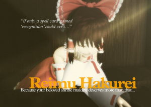
wallpaper_sad_reimu_1440

– HD format (1366×854)
wallpaper_sad_reimu_1366

– SVGA format (1024×640)
wallpaper_sad_reimu_sd

– VGA format (864×540)
wallpaper_sad_reimu_sd

Ah, one major mistake on this one!! I forgot the credits!! I’m posting them here:
Touhou Project © Team Shanghai Alice
Model by ISAO, Stage by nya, Effects by 針金P (HgPointLight), そぼろ (SvSSAO and Diffusion7)
Wallpaper made by Dioxaz © 2016

I’ll probably fix that later. I’m too lazy for now.

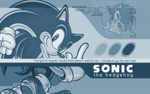
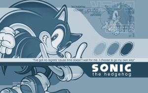
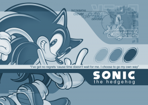
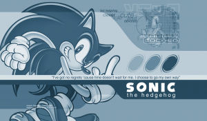
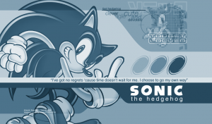
Monochrome Sonic – Dioxaz’s wallpapers, 2016 remake edition

Oh noes! Another one! And one of my favourite pieces on top of that. This reminds me of the days when I was called the “maniac of PNG”. Again, another sign of the times as almost everybody uses it now. This format almost replaced GIF in all the situations where GIF was used before. I think we call that a victory (in fact, I think it’s due to Internet Explorer 6 successors increasing market share starting from 2007 and the release of IE7 which finally introduced full alpha transparency support with PNG, without using any DX transformation plug-in).

Another very easy case because almost everything was in vector form (I had to convert only a few things). The tricky part was more the restricted composition by itself, which didn’t allow playing much when having headroom. Hence my decision to offer one more resolution, targeted for both SXGA (1280×1024) and WXGA+ displays (1440×900).

About the wallpaper, it just looks so great it’s unbelievable. I could almost have made it now. I can’t remember what inspired me to do it at the time. All I can say is that I was doing a two-year technical degree in IT at the time (yes, I’m way older than you think).

And now, the beast (click on thumbnails for original size):

– 2K format (2560×1600)
wallpaper_sonic_04_2560

– FHD format (1920×1200)
wallpaper_sonic_04_1920

– For older small widescreen and standard monitors (1440×1024)
wallpaper_sonic_04_1440

– HD format (1366×800)
wallpaper_sonic_04_1366

– SD format (1024×600)
wallpaper_sonic_04_sd

In case you didn’t notice it, there’s a good reason why it’s monochrome. This way it can compress as efficiently as it was greyscale, but instead uses a 256-colour palette made of shades of one colour. I think nobody other than me can produce such PNGs without messing up (palette must be kept in order and compression must be made with filter 5, using Ken Silverman’s pngout for example).

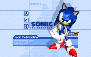
Adventure DX Sonic – Dioxaz’s wallpapers, 2016 remake edition

Yay, another one! Originally made in 2004. I’ll probably do one or two more and stop there. As you can see, another relatively easy case with lots of vector graphics (title bands at the bottom) and text. The trickiest part were the repeated “SONIC” patterns at the background (both the straight and rotated one), as they were already bitmapped (Photoshop doesn’t let you fill with a vector pattern yet, to my knowledge). I obviously had to recreate those parts with a higher resolution source (thank you http://info.sonicretro.org/). Then you have the artwork itself and the logo. You may remember how it was not the best quality (getting art assets was very hard back then and you often had to scan or extract them yourself, let alone getting them in professional quality!). Now I stumbled across this wonderful resource which is Sonic Scanf. Its official art gallery (http://en.sonicscanf.org/gallery/official-art/) can be easily designated as a true spiritual successor to my now abandoned Sonic Art Archive (Sonic Retro also has worthwhile pieces of art in high resolution). Sure it still has some uncredited and unauthorized reprints from my old website but I don’t really care now. In fact, its webmaster made the correct decision IMHO. This gallery “saved my life” as it provided huge resolution PNGs of both the artwork and the SADX logo. Its webmaster earns good points for maintaining his gallery the same way I maintained mine ten years ago (it has the latest pieces available). This is an indicator of how times have changed in ten years.

About the wallpaper, this is one of those pieces that still look great when I look at it, even a decade later. The same cannot be said about countless attempts made by inexperienced fans back in the day.

Here it is for your greatest pleasure (click on thubnmails for original size):

– 2K format (2560×1600)
wallpaper_sonic_03b_1920

– FHD format (1920×1200)
wallpaper_sonic_03b_1920

– HD format (1366×800)
wallpaper_sonic_03b_1366

– SD format (1024×600)
wallpaper_sonic_03b_sd

Did this piece really stand the test of time? You are the judge. It sure has a retro vibe now anyway.